Clark's Pain Cream
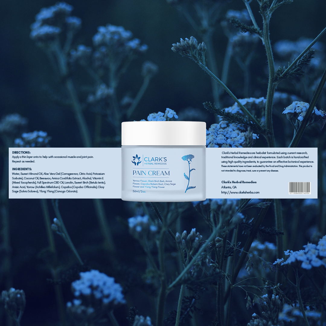
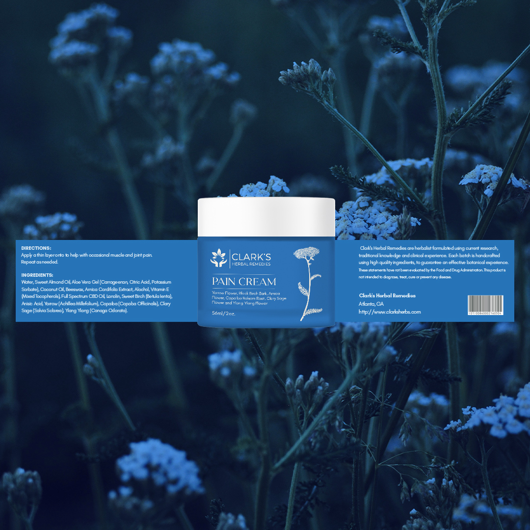
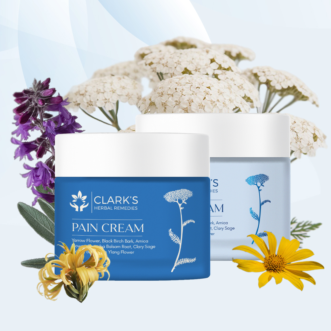
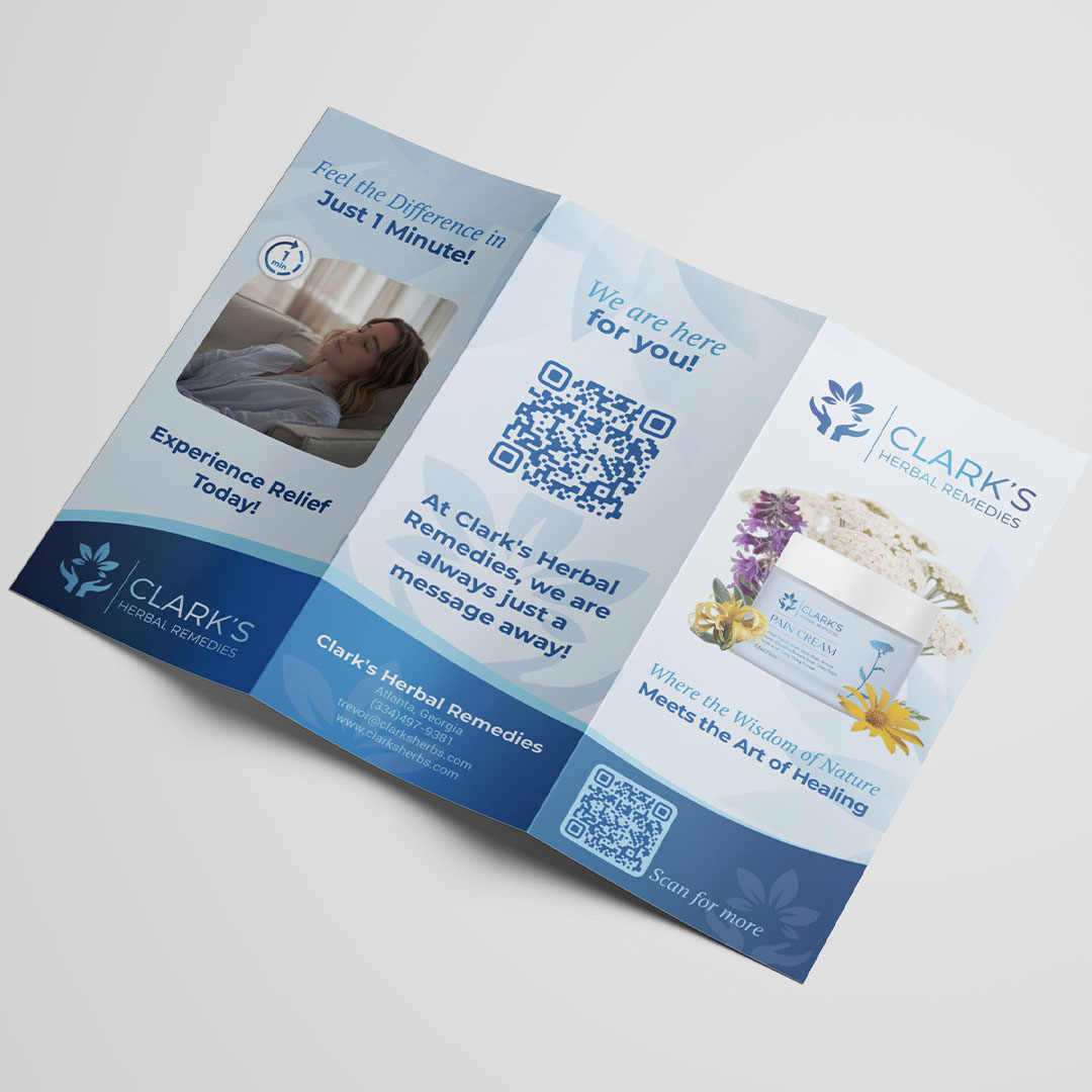
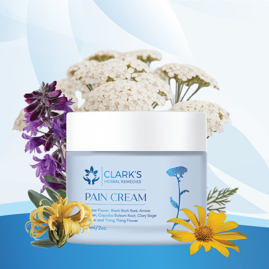
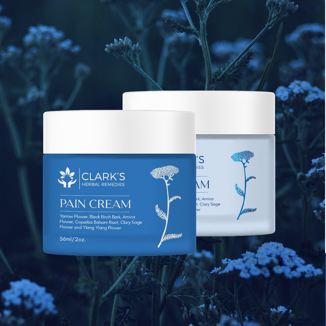
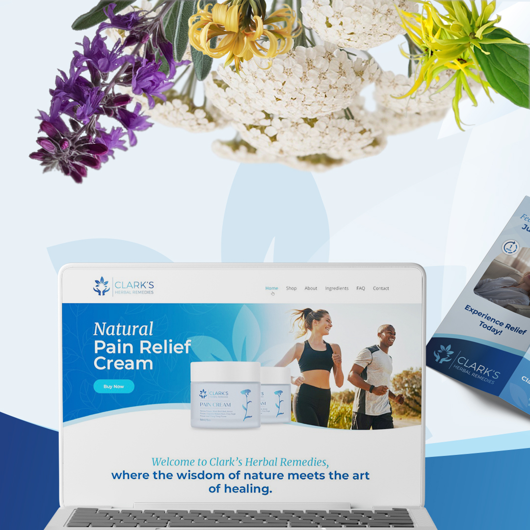
This project involved the complete redesign of the pain cream label for Clark’s Herbal Remedies. The goal was to transform the outdated packaging into a fresh and modern visual identity that reflects the brand’s use of natural, handpicked ingredients. The new look emphasises soft and dark blue shades to evoke trust, calmness, and a connection to nature, aligning perfectly with the soft blue color of the cream itself.
Client
Clark’s Herbal Remedies
Type
Branding and Package Design
Date
May 2024
Project Scope
Packaging Design: A refreshed label featuring clean, professional typography and herbal motifs to communicate the natural origin of the product. The soft blue and dark blue shades harmonize with the product’s soothing nature.
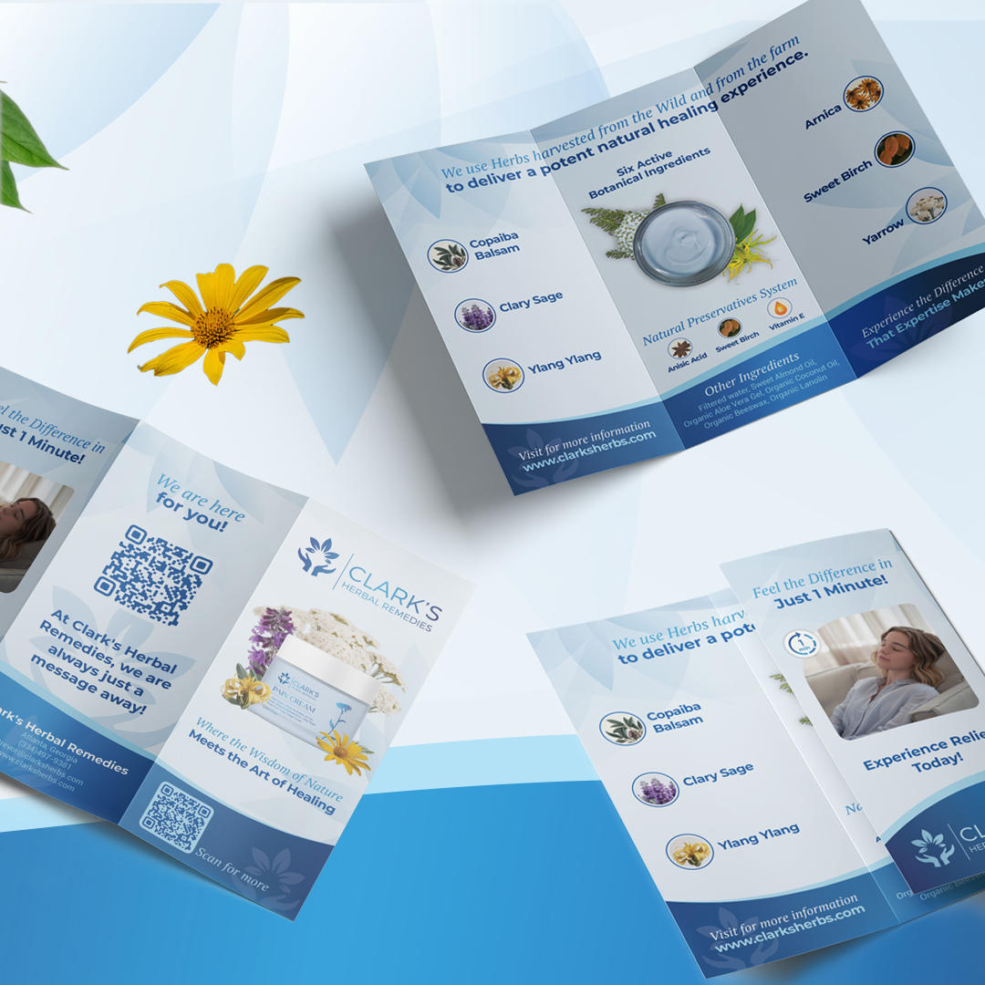
Branding Materials: Extended the design language across brochures, incorporating imagery of natural herbs and soft gradients for a cohesive look.
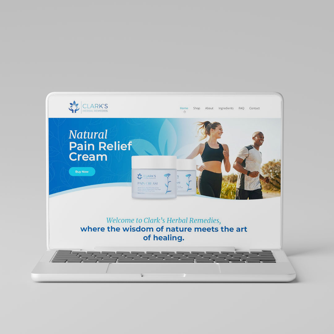
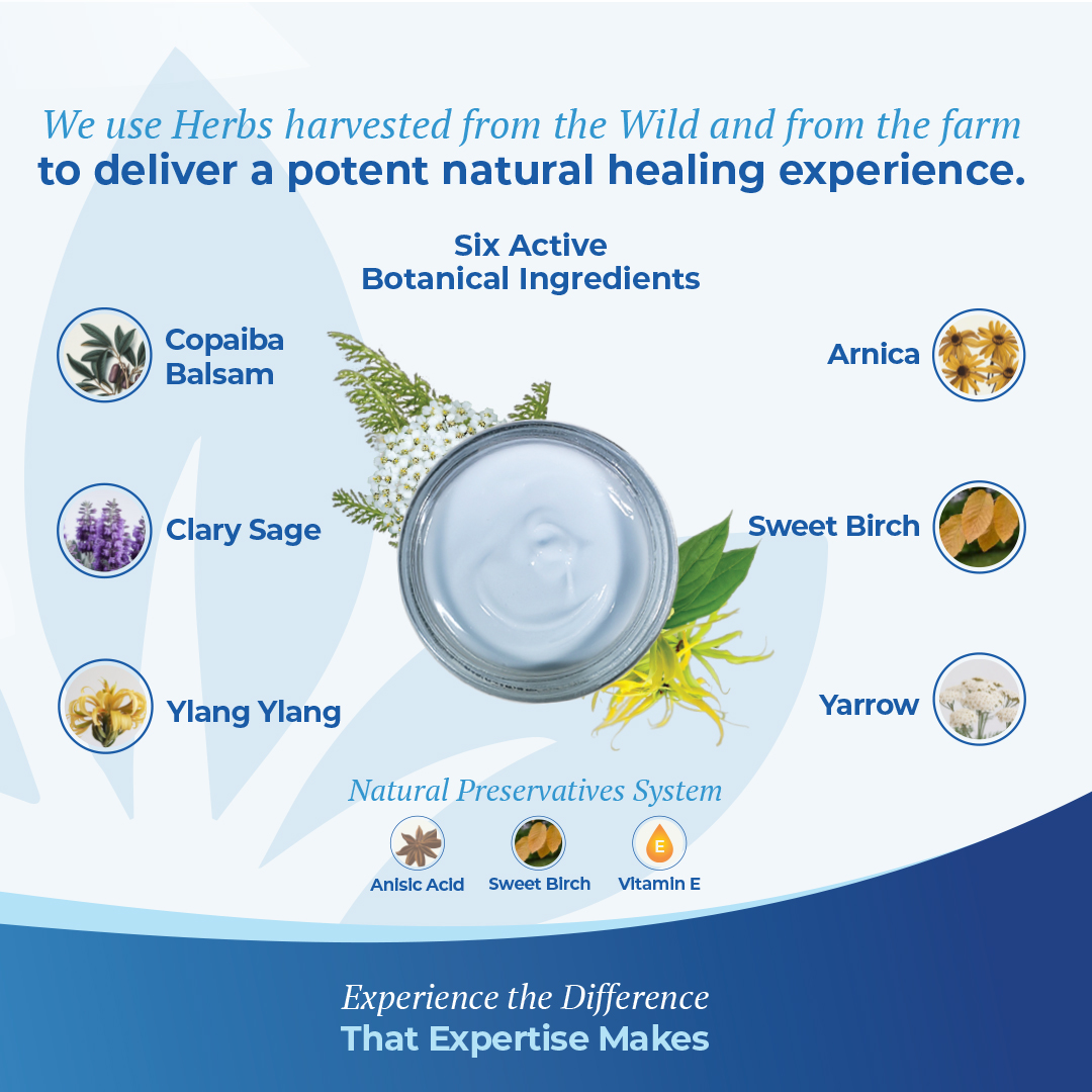
Web and Social Media Presence: Created website visuals and social media assets to match the branding, ensuring consistency and a visually engaging online presence.
This comprehensive redesign not only modernized the product’s appearance but also enhanced Clark’s Herbal Remedies’ overall brand identity, creating a lasting impression on customers while staying true to its herbal heritage.

