Zendo is a premium yoga studio based in Guangzhou, inspired by the Japanese concept of “Zendo,” which embodies mindfulness, tranquility, and the traditions of tea ceremonies. This project aimed to create a holistic branding system, visual identity, and app design that reflect the studio’s philosophy of balance and relaxation.
Client
Zendo yoga studio
Type
Branding and App Design
Date
August 2022
Project Scope
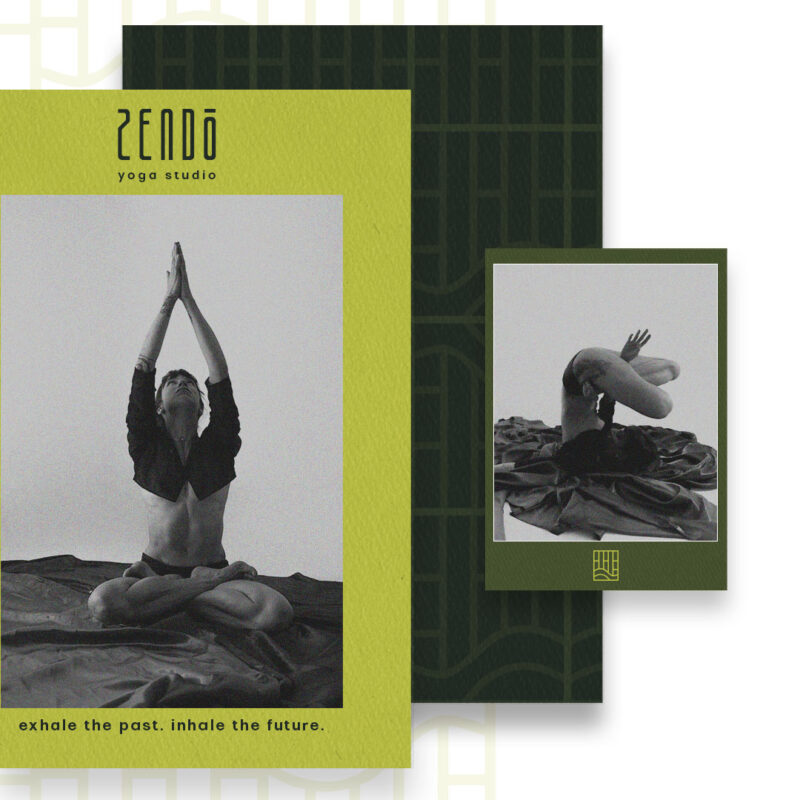
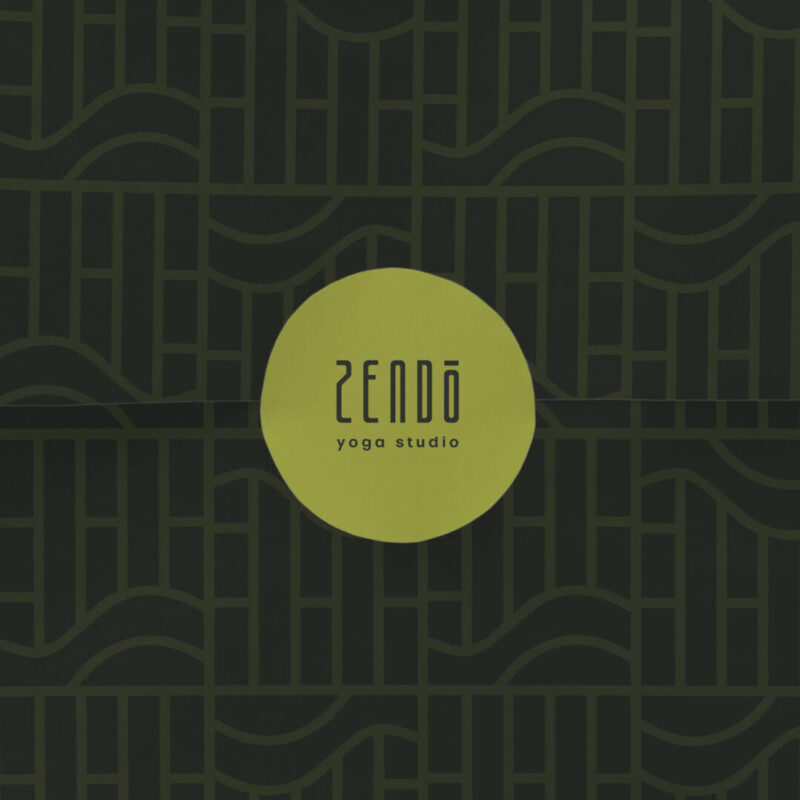
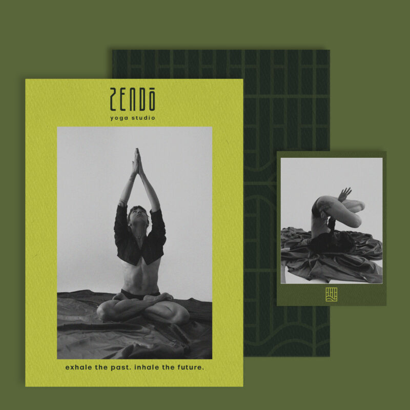
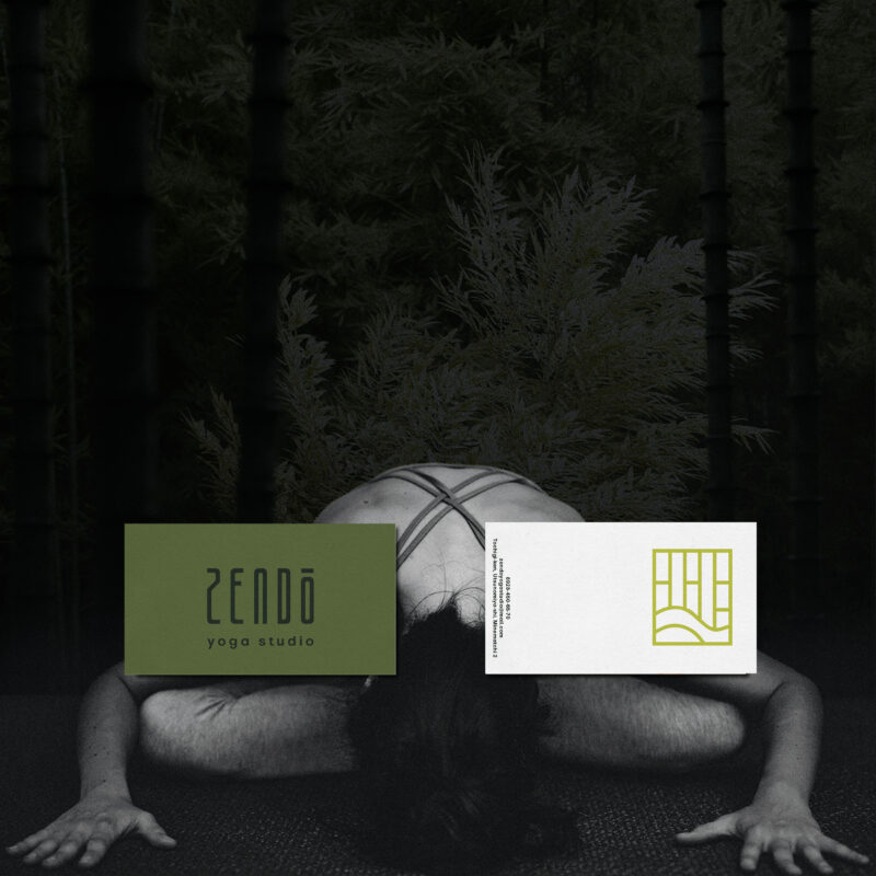
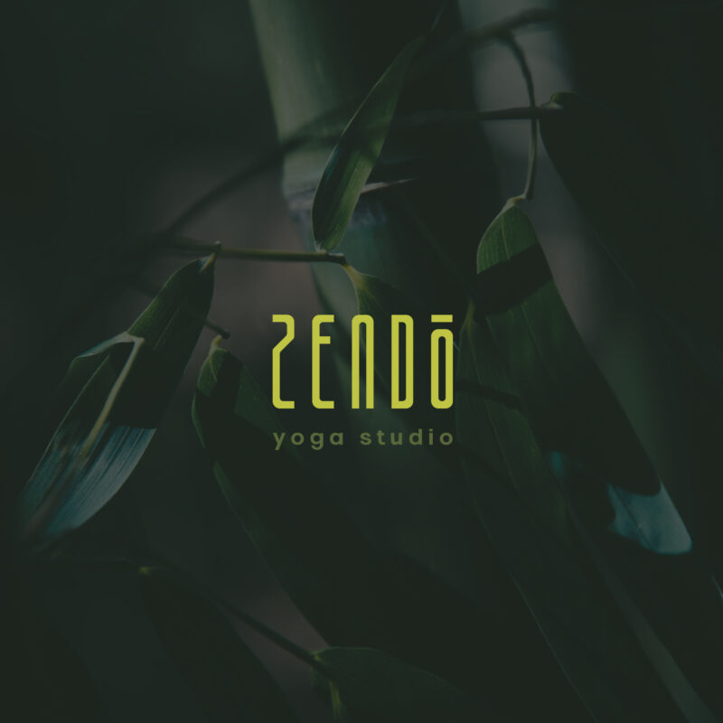
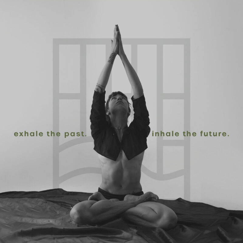
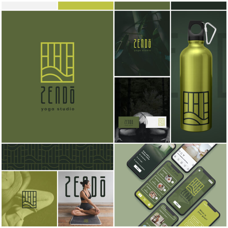
Our approach focused on crafting a serene and inviting aesthetic deeply rooted in Eastern traditions. The visual identity draws inspiration from Buddhist Zen gardens, bamboo forests, and natural textures to evoke harmony and connection with nature. The calming green color palette reinforces the tranquil atmosphere and highlights the stress-relieving and mindfulness benefits of yoga practice.
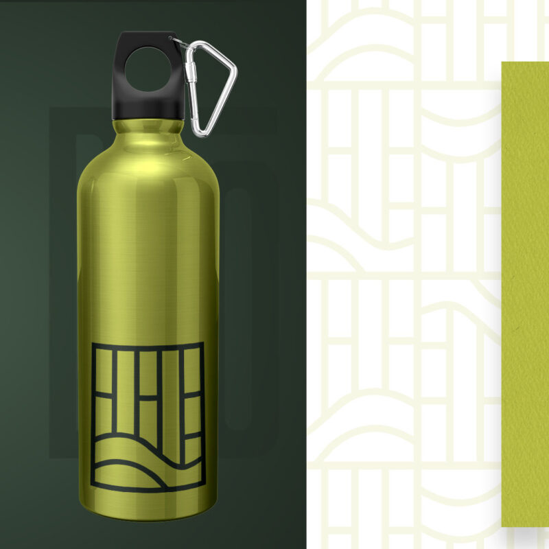
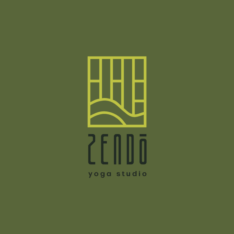
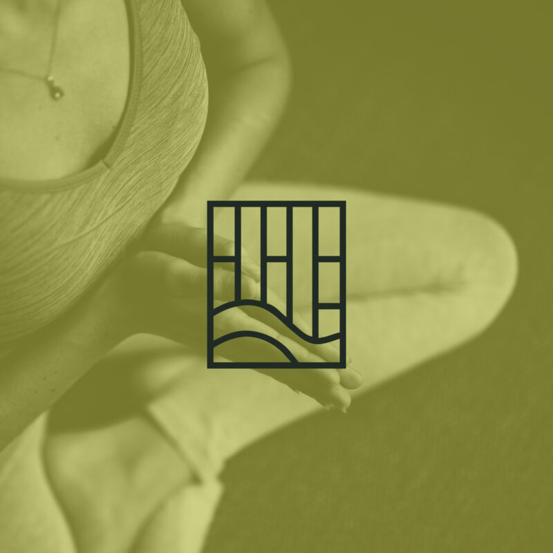
The minimalist logo design incorporates a linear illustration of bamboo, symbolizing growth, stability, and serenity. Combined with a structured and elegant typeface, the logo communicates the professionalism and authenticity of the Zendo brand.
As part of the project, we also designed a sleek and user-friendly mobile app. The app serves as an extension of Zendo’s brand, offering clients a seamless way to explore yoga classes, book sessions, and access mindfulness resources. Its intuitive interface and cohesive visual language ensure a calming digital experience that aligns with Zendo’s values.
Additional branded materials, such as eco-friendly merchandise and promotional designs, further enhance the consistent and serene identity across all touchpoints. This project demonstrates how culturally inspired and thoughtfully designed branding, combined with functional app development, can effectively capture a brand’s essence and elevate the client experience.